/HubSpot%20-%20eBook%20-%20Proof%20Card%20Mockup%20001.jpg?length=1000&name=HubSpot%20-%20eBook%20-%20Proof%20Card%20Mockup%20001.jpg)
/HubSpot%20-%20eBook%20-%20Proof%20Card%20Mockup%20001.jpg?length=1000&name=HubSpot%20-%20eBook%20-%20Proof%20Card%20Mockup%20001.jpg)
/HubSpot%20-%20eBook%20-%20Proof%20Card%20Mockup%20001.jpg?length=1000&name=HubSpot%20-%20eBook%20-%20Proof%20Card%20Mockup%20001.jpg)
/HubSpot%20-%20eBook%20-%20Proof%20Card%20Mockup%20001.jpg?length=1000&name=HubSpot%20-%20eBook%20-%20Proof%20Card%20Mockup%20001.jpg)


/HubSpot%20-%20eBook%20-%20Proof%20Card%20Mockup%20001.jpg?length=1000&name=HubSpot%20-%20eBook%20-%20Proof%20Card%20Mockup%20001.jpg)

/HubSpot%20-%20eBook%20-%20Proof%20Card%20Mockup%20001-min.jpg?length=1000&name=HubSpot%20-%20eBook%20-%20Proof%20Card%20Mockup%20001-min.jpg)
/HubSpot%20-%20eBook%20-%20Proof%20Card%20Mockup%20001-min.jpg?length=1000&name=HubSpot%20-%20eBook%20-%20Proof%20Card%20Mockup%20001-min.jpg)

Evolving the Brand, Keeping the Identity
When updating Orchestry to version 2.0, we focused on more than just improving the appearance. We wanted to completely change how users interact with the platform.
This redesign was paramount given Orchestry's crucial role in balancing Microsoft Teams adoption and governance controls. Entering this project meant balancing legacy with innovation. In a constantly changing digital world, our main challenge was preserving Orchestry's essence as its design evolved.
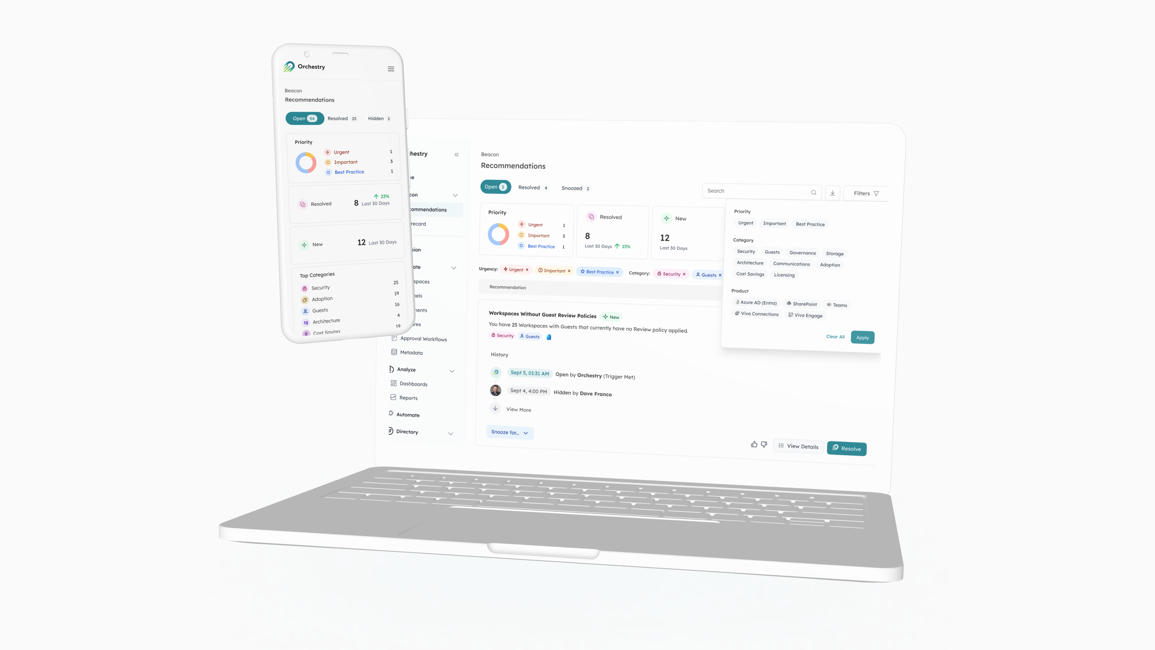
A Holistic Approach to Design
Visuals are important, but the main thing about Orchestry is how well it combines both appearance and functionality. With the belief that progress requires constant evolution, we dedicated the last four months to revamping our platform.
Using simple wireframes in the early design process, we focused on making the user experience easier. We added elements at the right time to help users the most. We aimed to strategically deconstruct and reconstruct user pathways, ensuring intuitive and timely user interactions.
In the ever-evolving world of Microsoft 365, users face a real threat of change fatigue. While essential for security and feature enhancements, continuous updates can sometimes disorient users if not implemented thoughtfully.
In redesigning Orchestry, our challenge was to align with contemporary design trends, presenting a fresh and modern look. Also, to ensure that in doing so, we addressed this change fatigue. Our modernization efforts did not need to compromise accessibility or the foundational user experience.
We wanted to keep users informed and ready for the change. We aimed to strike a balance between their existing knowledge and the new information.
.png?width=3840&height=2160&name=MicrosoftTeams-image%20(1).png)
Crafting a Cohesive Hierarchy
Design is not just about aesthetics but also about the harmony of its elements.
Orchestry already had a robust design framework, but our goal was to enhance its cohesion further. We wanted to integrate every component into a broader design and information architecture. This was not just an aesthetic endeavor but a strategic one, setting the stage for the platform to adapt and grow, accommodating potential expansions and innovations.
Typography, color schemes, and design elements were not isolated entities but interconnected components of a holistic user experience. By crafting this cohesive architecture, we ensured that users could navigate the platform with heightened intuitiveness, effortlessly absorbing and engaging with the information presented. This approach strengthens Orchestry's current position and creates a flexible foundation for future growth areas.
The Lexend Typeface
Typeface isn't just a design choice—it's an ambassador of brand voice and a catalyst for user engagement. Our selection, "Lexend," wasn't merely for its contemporary style but for its unparalleled scores in accessibility and usability. Lexend, designed with superior readability metrics, became an Obvious choice for a platform where communication clarity reigns supreme.
.png?width=3840&height=2160&name=MicrosoftTeams-image%20(2).png)
Color Palette – Bridging Yesterday with Tomorrow
Orchestry's brand colors are a significant part of its identity. While maintaining loyalty to these original hues, we expanded the spectrum. We elevated the platform's visual appeal and enhanced its functional dynamism, assisting in information categorization and differentiation.
.png?width=1920&height=1080&name=MicrosoftTeams-image%20(3).png)
Iconography Reimagined
Our modern vision translated into the adoption of outlined icons. Their lean design imparts a fresh vibe, with varying color intensities and stroke thicknesses strategically employed to guide user focus. Complementing these are design flourishes like circles, lending character and depth to the overall interface.
Design System
Creating a design system is more than just following a set of guidelines. It represents the essence of a brand. Our design system represents Orchestry's brand, mission, and forward-thinking approach. This carefully crafted plan guarantees that every aspect of our platform tells a cohesive brand story, reflecting our values and vision.
.png?width=3840&height=2160&name=MicrosoftTeams-image%20(5).png)
Orchestry's 2.0 journey is a testament to the continuous dialogue between our brand and audience. Stay tuned for our next post, where we'll explore the invaluable insights from user feedback and their profound impact on refining and perfecting our new design.
Tag(s):
Orchestry